GAZ, Pepsi, Apple: how the logos of famous companies changed (34 photos)
Over time, everything changes. Art, fashion, rhythm of life. Not surprisingly, among all this there are logos. Including companies whose products we use every day or at least see on store shelves. 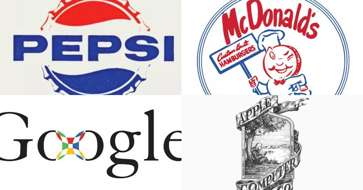
Pepsi 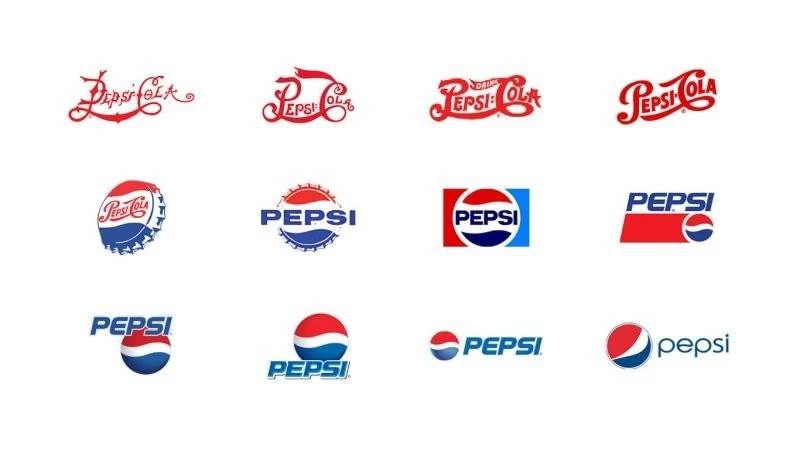
The history of the brand itself began at the end of the 19th century and from the very first steps in the industry it competed with Coca Cola. From 1898 to 1940, it had a red curly font that closely resembled its main competitor's font.
However, the second attempt to introduce a new product occurred in 1905. Then the logo was made simpler and a “flag” was added.
And already in 1906, additional text was included in the name, but the typography was still similar to the original. True, rounded outlines are already visible, and the word “drink” was added to that same flag.
By the way, about the spherical shape. One of the reasons for using it was that the company wanted to add The Original Pure Food Drink slogan to the design.
In 1940, the company returned to a rectangular logo with a completely white background, and in 1945 added blue to show support for the US Army (seen on the cap in the photo above). The logo included the slogan Bigger Drink, Better Taste. That is, larger volume, but better taste - another stone in the competitor’s garden. That is, the same price, but the volume is larger and the taste is better. And then the volume really greatly exceeded that of Coca-Cola. It was twice as big. 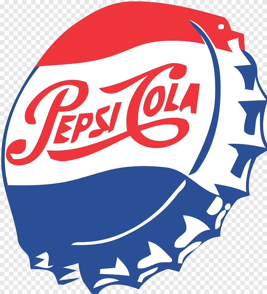
In the 60s, the logo acquired a jagged cap, and the Cola inscription also disappeared. Since then, the brand has not used it at all. But the colors have remained approximately the same since then.
But in the 70s, the brand abandoned the lid, coming to minimalism. The white background also disappeared, but white highlights of the rectangular and spherical borders of the logo appeared. The font has changed again, but not so dramatically.
In the 90s, the sphere generally faded into the background, to the lower right corner. And the font changed so much that it no longer resembled the original version at all, and a white background reappeared. 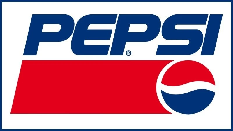
In 1998, the company celebrated its 100th anniversary. To commemorate the anniversary, the company made some changes to its logo design to give it a three-dimensional look. For the first time, the background changed from white to blue, and white was used in the font.
Today's Pepsi Globe logo has a design similar to a smiley face. It retains the colors from 1998, but there have been changes to the style and font. According to the designers, the logo should symbolize the globe. 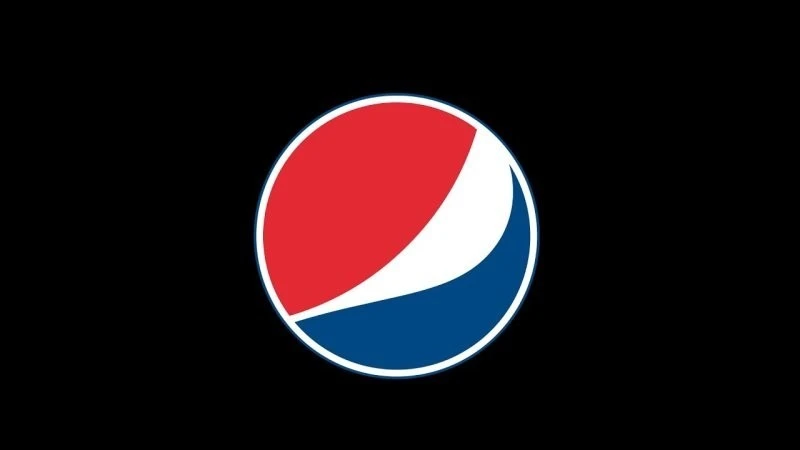
McDonald's 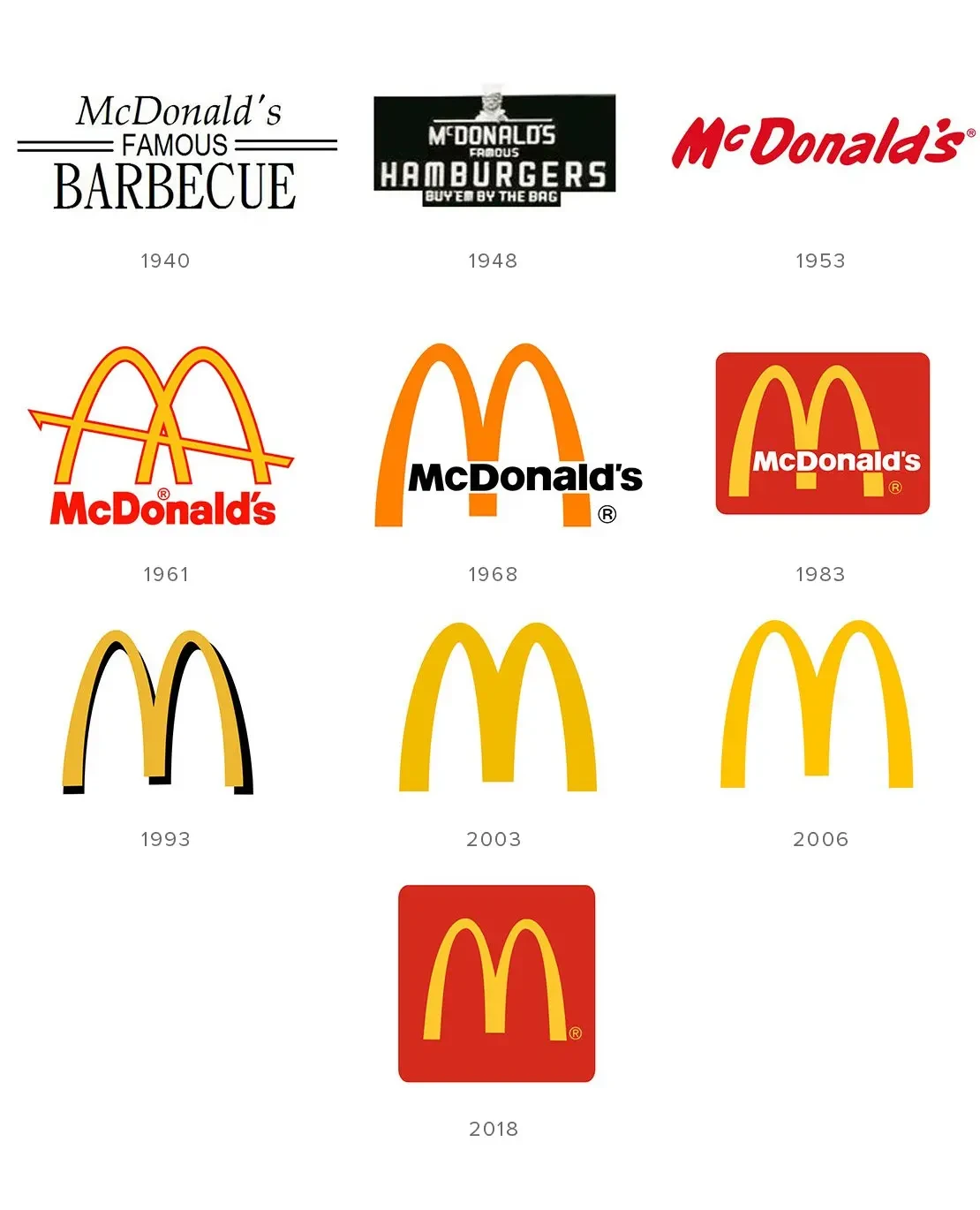
Initially, the brand name looked like a black inscription McDonald's Famous Barbecue on a white background. And then, 8 years later, the company changed its direction of work.
In 1948, the company placed on the logo an image of “chef” Speedy, who then became the main face of the brand for a very long time. He was holding an I'm SpeeDee sign in his hands. This is how they wanted to emphasize both the service and the speed of delivery. 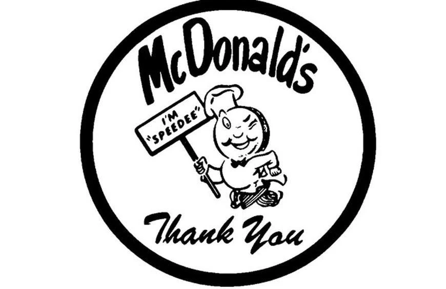
Then, in 1953, the chef became a thing of the past, and only an inscription with the company name appeared in the logo. The inscription was red, and the font was in italics, which, again, was supposed to be associated with speed.
And in 1961, the corporate letter “M” finally appeared in the logo. The logo itself was crossed out to create an image of the restaurant's roof.
Just 7 years later, the logo has become even simpler, the roof line disappears, and the emphasis is on the letter “M”.
And in 1983 we now see a yellow letter on a red background. The name itself is made in red colors. 
But just ten years later, the logo is simplified even more. The red background disappears, and the letter "M" acquires black shadows. But in 2003 they also abandoned shadows, thickening the letter itself. True, in 2006 the company again thinned the lines.
Then, the latest changes occur in 2018. The design is again on a red background, and the letter "M" is still the same. And the name, apparently, is so recognizable that it is not added at all. 
Of course, let’s skip the story with “Tasty, period.” After all, this is no longer the same McDuck. But maybe over time we will be able to trace this logo.
Google 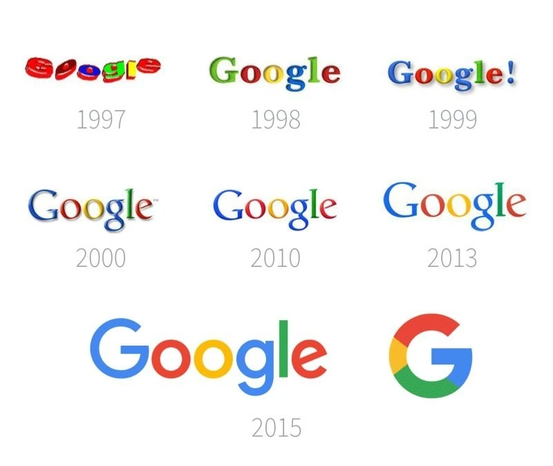
Google, in fact, has often experimented with design since its inception.
Initially, the company was called googol (a number in which there is one and one hundred zeros), that is, the very idea of the name is a reference to the speed of issuing a huge number of results.
In fact, the most widely known story is only the third design option, which appeared in 1999. Then an exclamation point was added to the company name, and there are rumors that it was developed in Gimp. 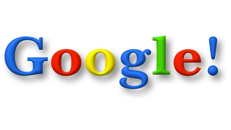
Then, for 11 years, there were many options from designer Ruth Kedar. It was she who removed the exclamation mark, making the letters black and placing a Chinese finger trap between the two "o's". 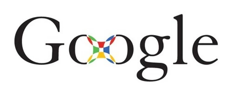
Then there was another font, with a target. 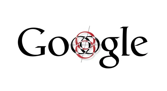
And then - the intertwining of two “o”. 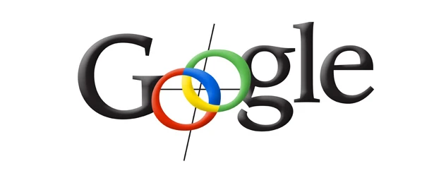
And with a magnifying glass... 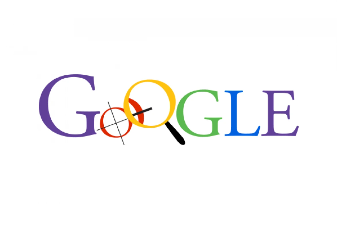
True, they abandoned the magnifying glass and made the letters three-dimensional, as if jumping off the page. This logo was official from 1999 to 2010. 
But in 2010, the yellow letter turned orange and the shadow disappeared. 
The latest changes took place in 2015. Then there was a special meeting for designers, during which the brand changed dramatically. The colors remained, but the font and the brand in general changed. However, there were several logo options. For smartphones - just a letter: 
For computers, a sans-serif font that easily adapts to all screens. 
Apple 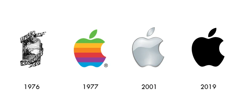
The first emblem is completely unrecognizable as the bitten apple. It depicts Newton under an apple tree, and the message, it seems to us, is clear to everyone.
Along the edges there was a microscopic inscription - Newton... A Mind Forever Voyaging Through Strange Seas of Thought... Alone. That is, "Newton... The mind that alone sails through strange seas of thought." This is a phrase from "The Prelude" by William Wordsworth. 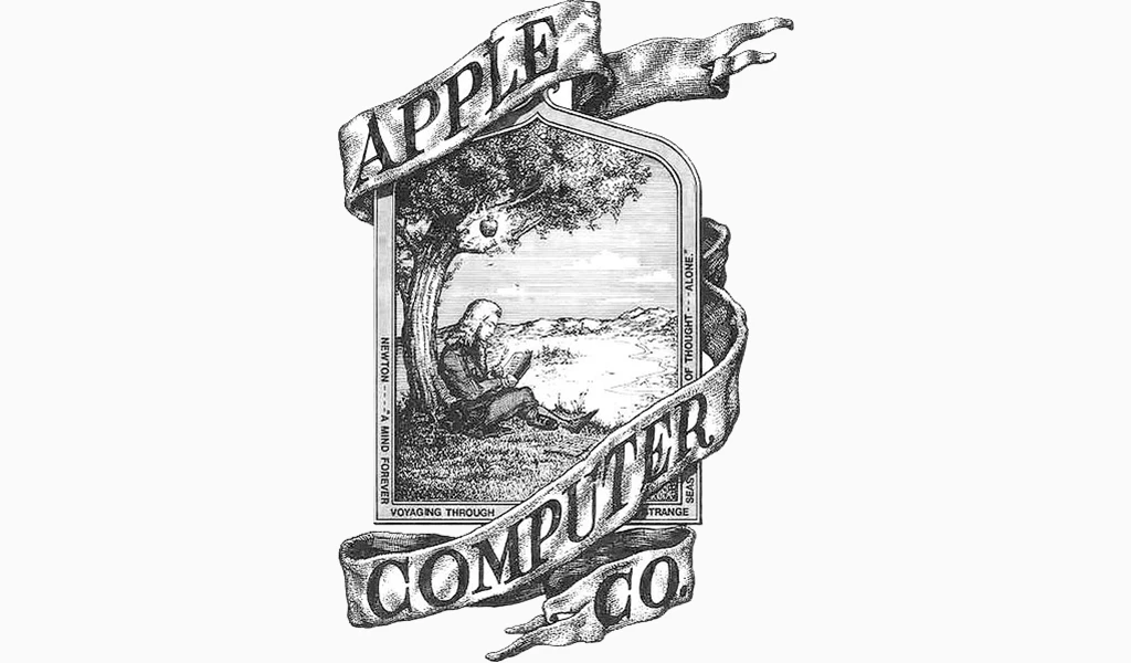
This, by the way, is the version of Ronald Wayne, who ran away from the enterprise two weeks later, selling his 10% shares for $800. So it goes. And now I could have over 100 billion in green papers.
Already the second logo was a bitten apple. The fact is that Wayne's logo was too complex, and they decided to abandon it. Jobs then asked designer Rob Yanov to develop a simple, modern logo that would be easily recognizable. And then a multi-colored apple with a bite was born. 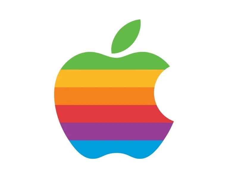
By the way, this had nothing to do with LGBT people and the logo appeared much earlier than all these movements and their flags. According to Yanov, this was only a reference to the company’s field of activity. Is your monitor color? Color. This means that the logo should be multi-colored. And just then six colors was the maximum number in the display.
True, in 1998 they abandoned flowers. It was a simple black bitten apple. The form is the same as in 1977.
In 2001, the apple gains shape and texture. That is, it becomes voluminous and mirror-like. They changed it only in 2007, making it silver or steel. 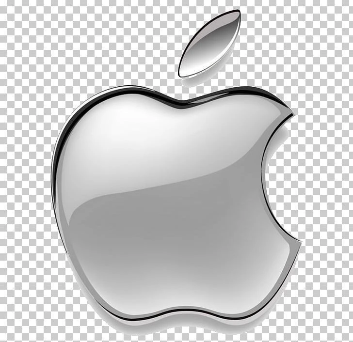
But already in 2015, the company abandoned unnecessary parts and returned to the 1998 version. Just a black apple. Or white, if black cannot be placed. 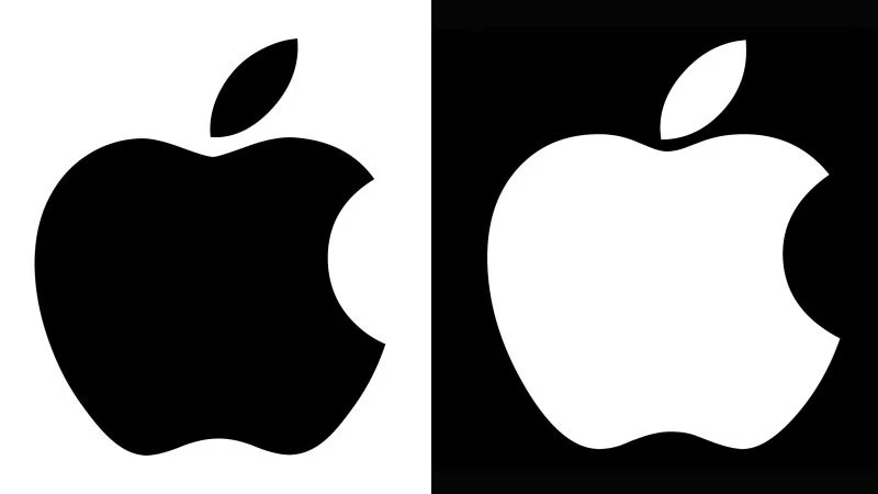
GAS 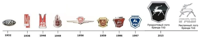
Logos changed not only overseas, but also here. But why deer? Why does this even have anything to do with the Gorky Automobile Plant?
In short, because there are a lot of forests in the Gorky region. And there are a lot of deer there. And if the bear has long been a symbol of the entire country, then at that time no one took the deer as a symbol.
Initially, there was no talk about deer. In 1929, the young USSR acquired a license from Ford (yes, from that same company) to produce cars. That is, both the shape of the cars and the logo were very similar to the American manufacturer. True, there was a hammer and sickle on the sides. 
The emblem was changed in 1936, when wings and a red star appeared on it. The inscription GAZ was written at the bottom. 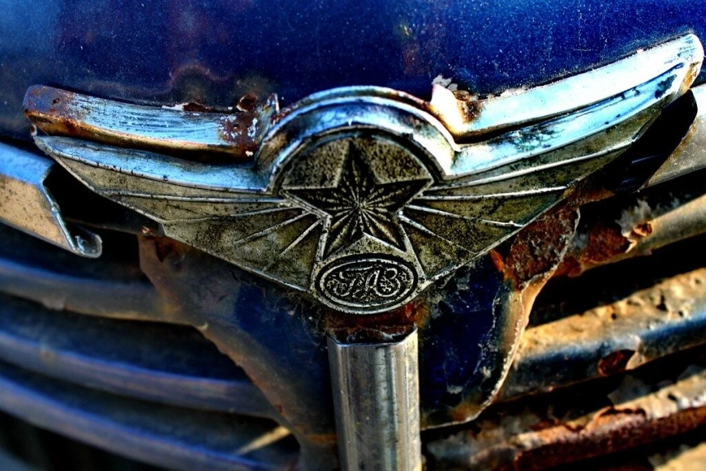
Beautiful...
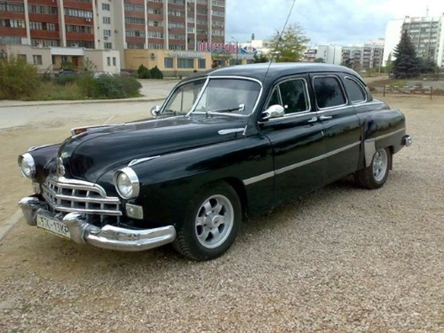
After the war, they began to produce the Pobeda car under the symbol GAZ-M-20, and a new emblem appeared. 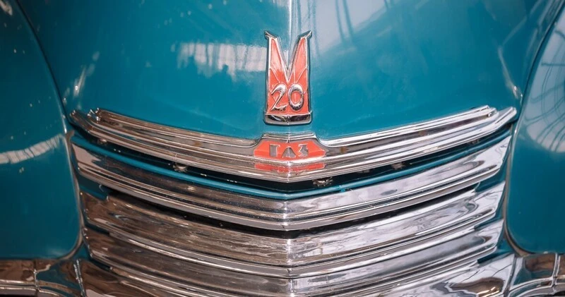
Then the letter "M" denoted the naming of the plant after Molotov. At the same time, the style resembled the towers of the Kremlin, and also a seagull over the Volga. In the lower part - “20”, that is, the engine capacity is 2 liters.
In 1949, the plant produced the ZIM car. And then it was decided to make our own emblem for it. There is a red star at the top that resembles a Kremlin tower. The lower part is the shape of a coat of arms, on a red background of which... a deer is depicted. Yes, we finally got there! 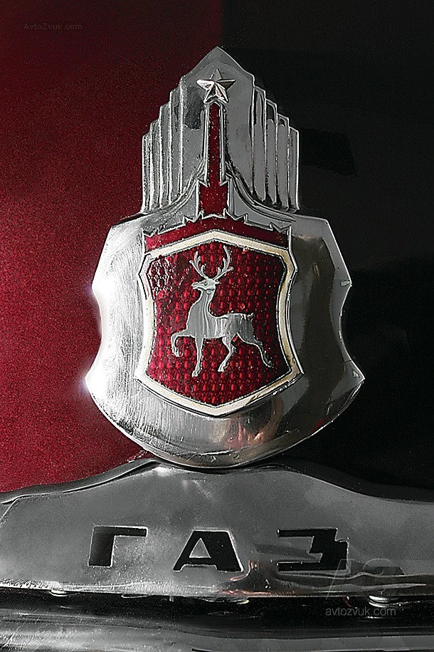
Since then, the deer has become a fixture in GAZ's life. The next option was with side elements, but without the red star, but with side elements. 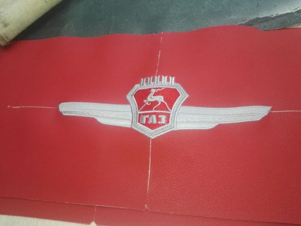
Then there was a simplified version, basically the same, but without wings. It appeared in 1959. We used it for the major "Seagull". At the same time, the frame of the shield became wider. 
And in 1986, this symbol became the basis for all models. Since then, the logo has changed slightly, only changing the color scheme. But in 2015, a rebranding took place, and in the end it was decided to simplify the shield, make it silver, and place the deer on a black background. The animal itself was detailed. This is how it looks on cars. 
And so - in advertising. Already without a shield. 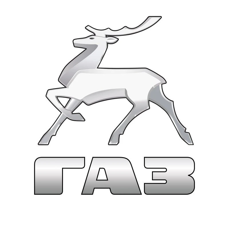
We'll talk about other brands next time.