11 famous brands that changed their logos in 2023 (13 photos)
Let's see what the logos of famous companies look like before and after a fresh rebranding. 
We show you the most noticeable changes in the image of famous brands and companies that decided to redesign their logos in 2023. Some people perform this ritual once every few years, while others did it for the first time in a very long time. Looking at these examples, we can conclude that the trend now is minimalism, rich colors and, in some cases, a kind of return to roots.
Twitter became X 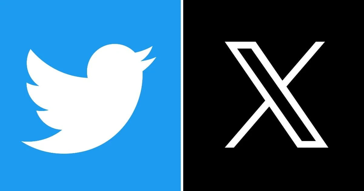
The most radical logo change of all, and definitely the most sensational one this year.
Pepsi 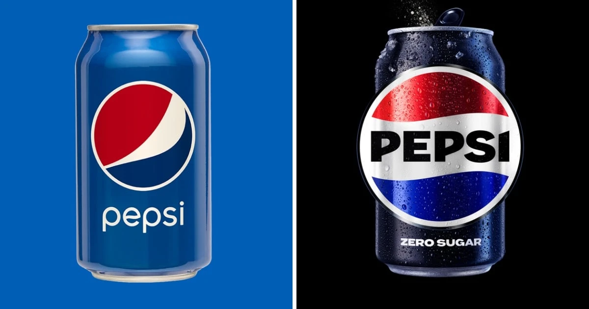
The logo was changed in honor of the company's 125th anniversary.
Nokia 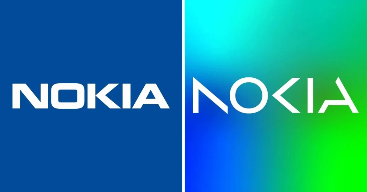
The company changed its logo for the first time in 60 years!
Fanta 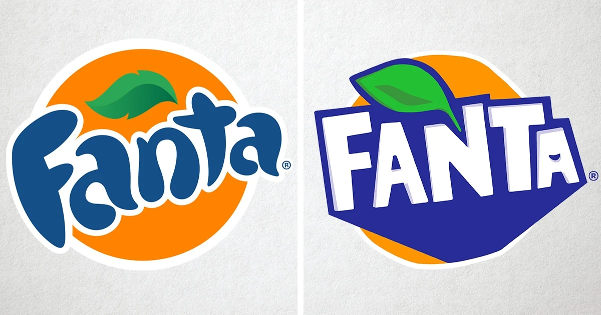
Reddit 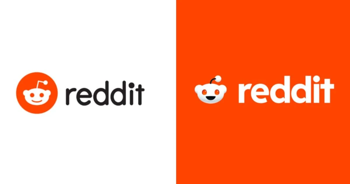
7 Up 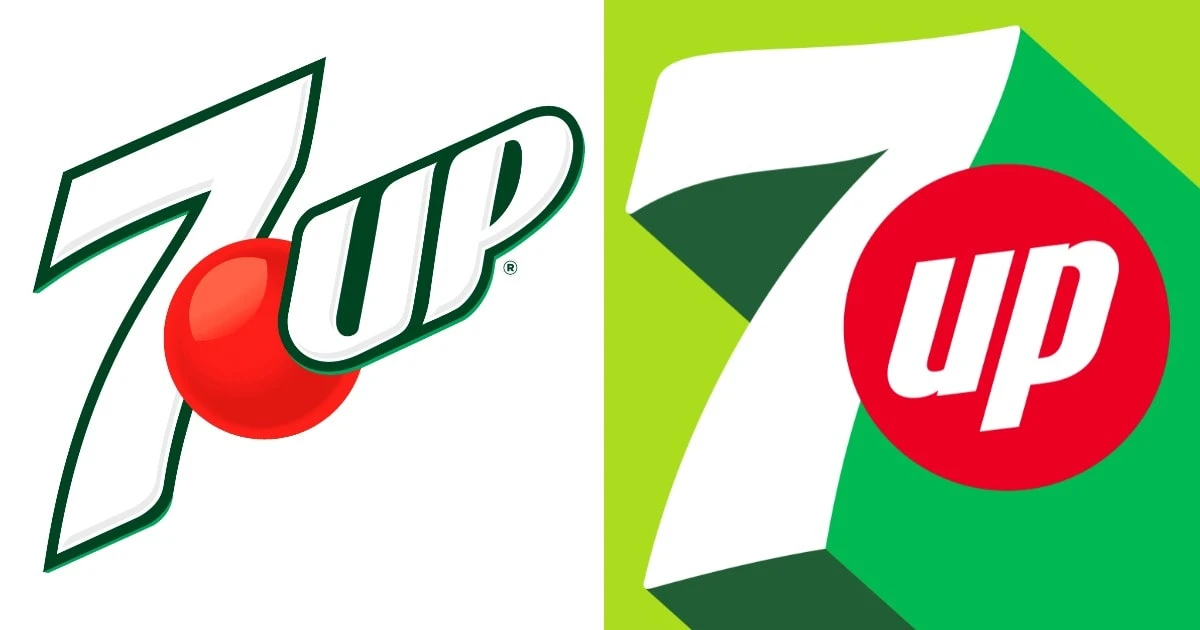
As you can see, this year the drinks all decided to change their logos.
Warner Bros. 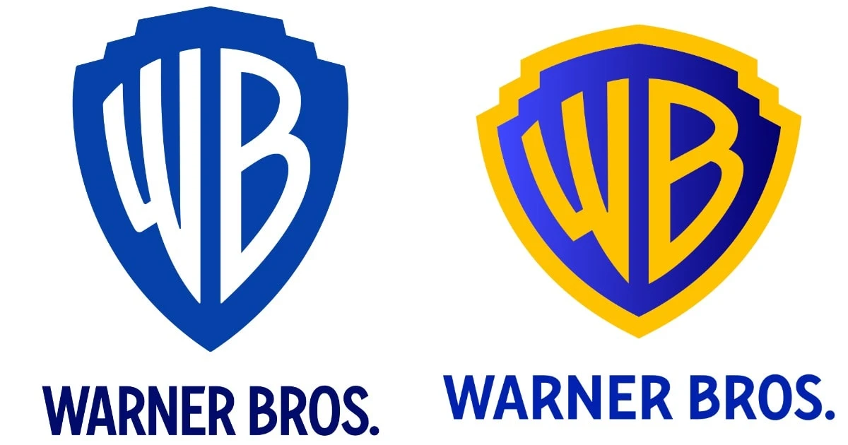
The film studio returned to its roots in style to celebrate its centenary.
MTS 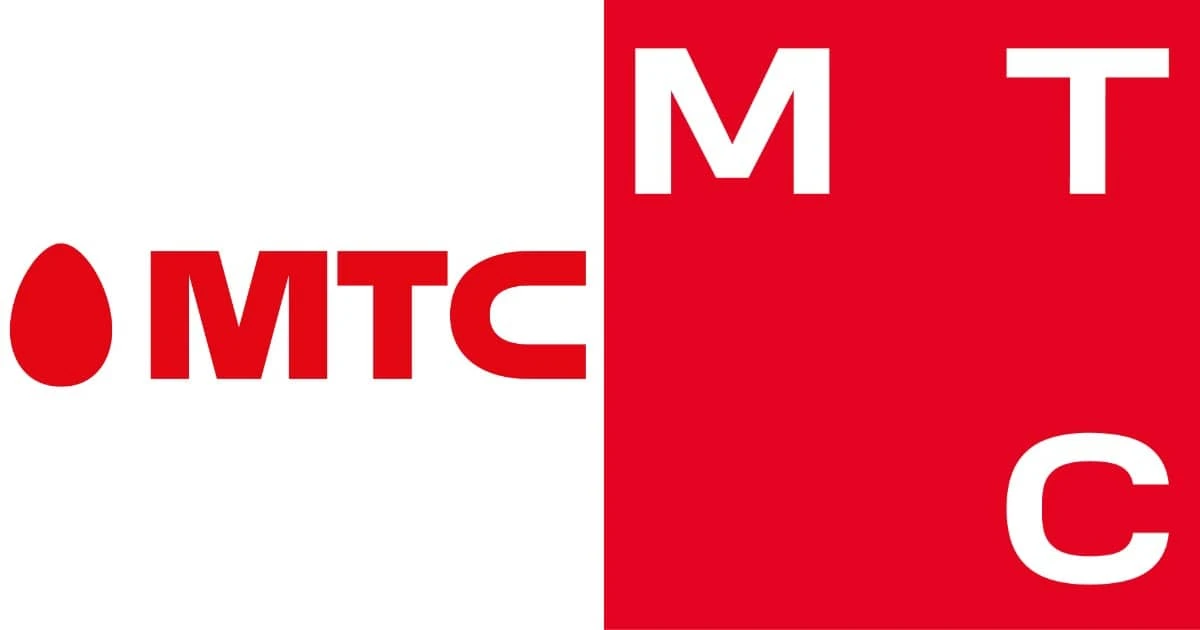
The egg has been the company's symbol since 2006.
Android 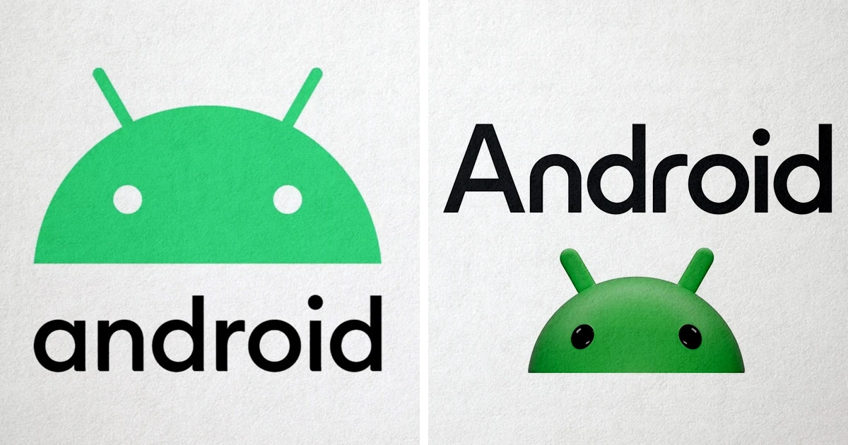
As in the case of Reddit, the symbol became more realistic, voluminous and seemed to come to life.
LG 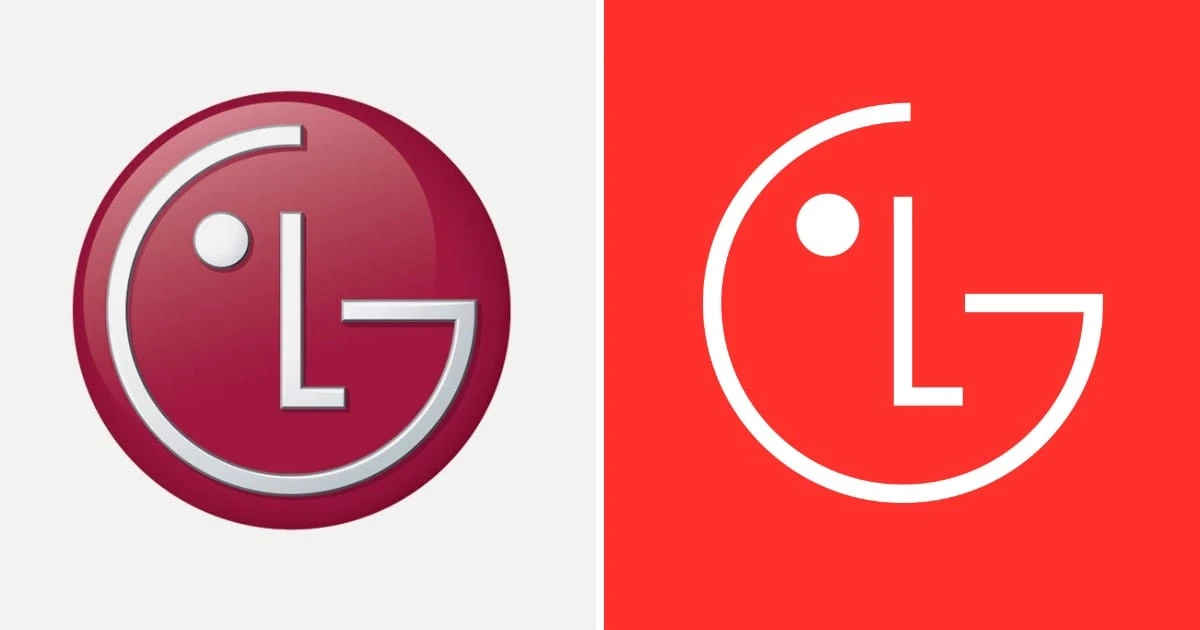
But representatives of LG went in exactly the opposite direction - their symbol ceased to be three-dimensional.
Classmates 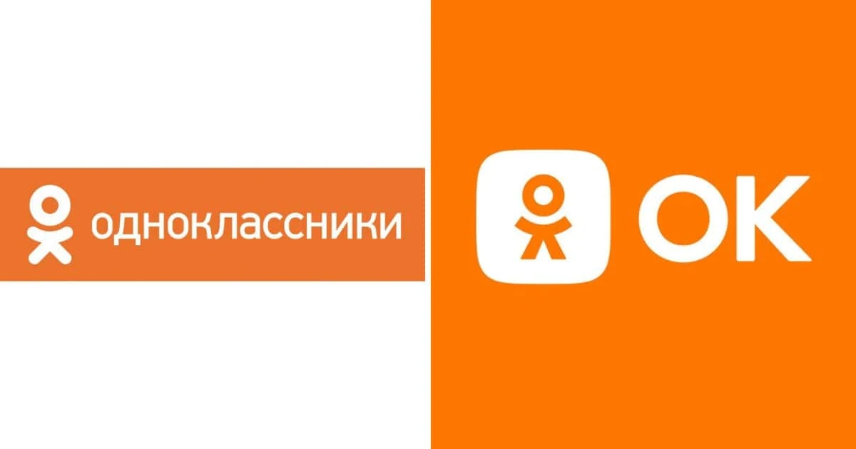
Bonus: Walt Disney Pictures 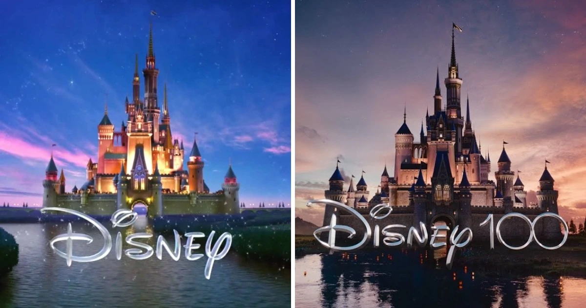
All new studio projects this year are released with a special opening screensaver, which reminds that in 2023 the legendary Disney turns 100 years old!