30+ interesting maps that will expand your understanding of the world (34 photos)
When most of us hear the word “data,” our eyes glaze over and our heads conjure up a million Excel cells. So smart people rolled up their sleeves and got to work creating data visualizations. Here are maps that help put all sorts of facts and figures in context. So get comfortable and get ready to improve your knowledge. 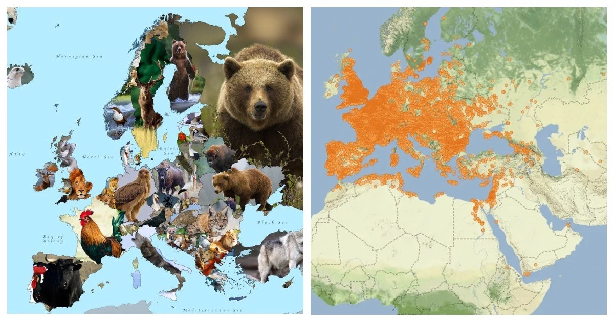
1. It’s rare to see a good map of Oceania 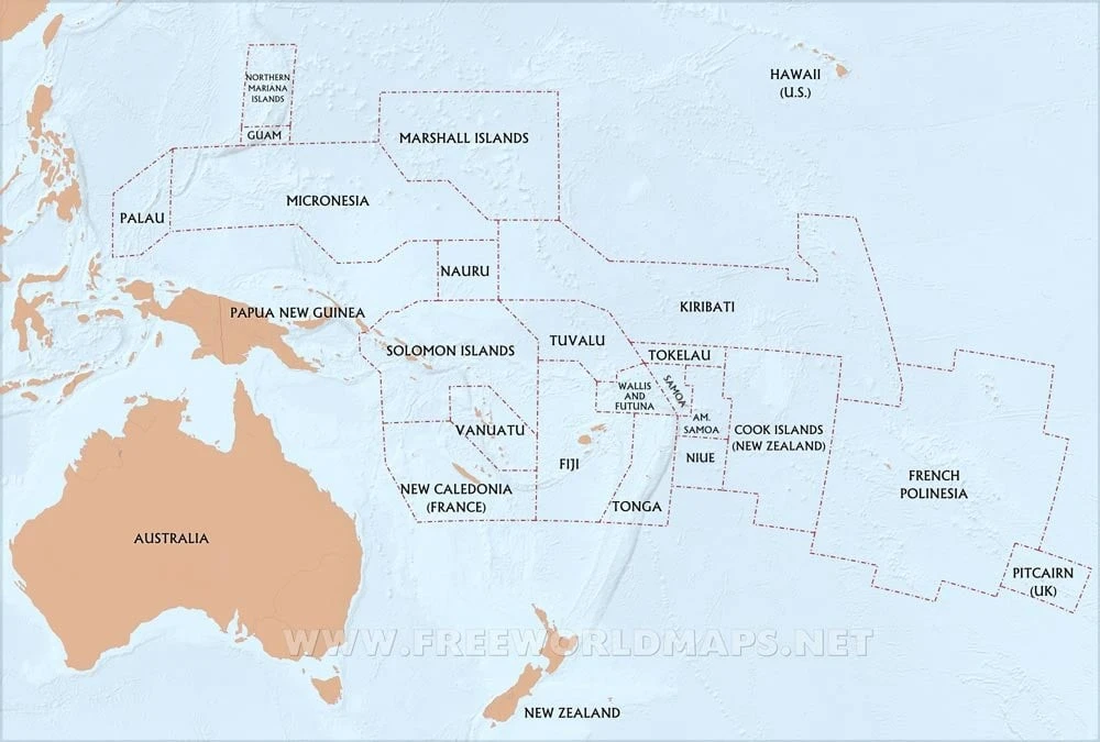
2. The literal meaning of the names of African countries 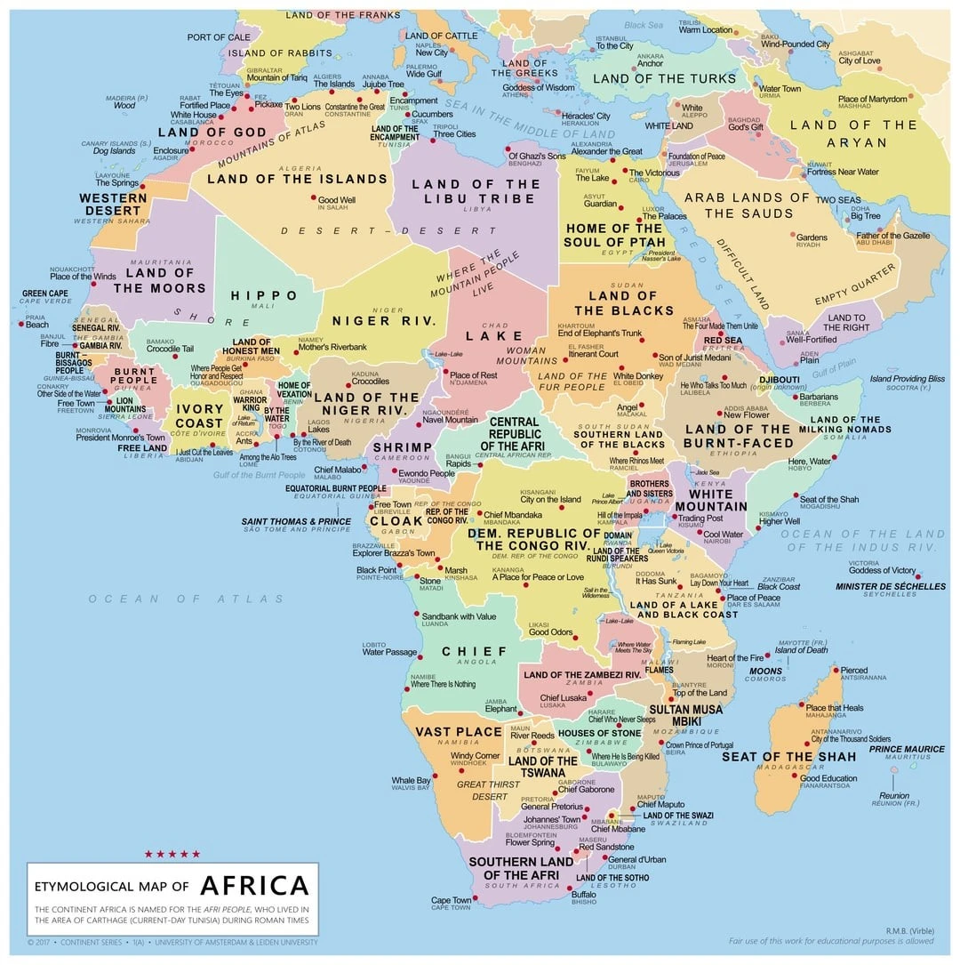
3. Time required to earn 1 million euros with an average salary 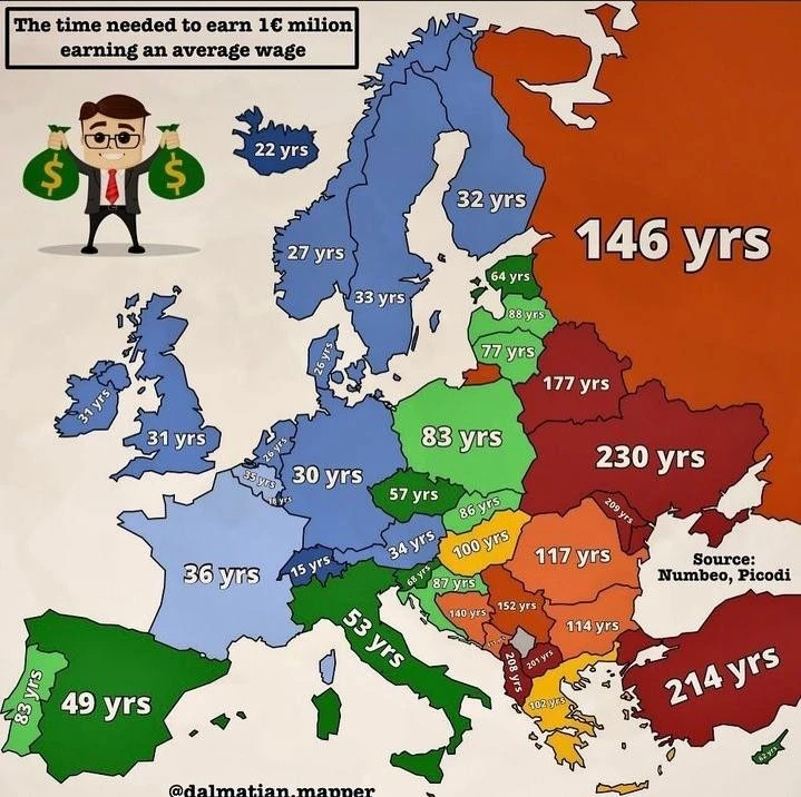
4. Endings of names of settlements in Poland 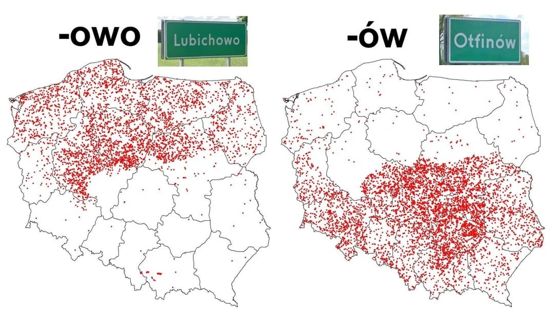
5. Which sport is most popular? 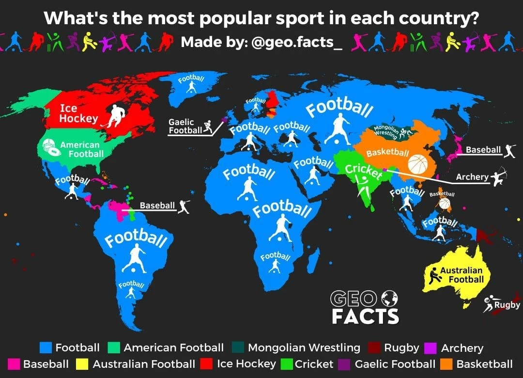
6. Percentage of population aged 25-64 who do not speak any foreign language 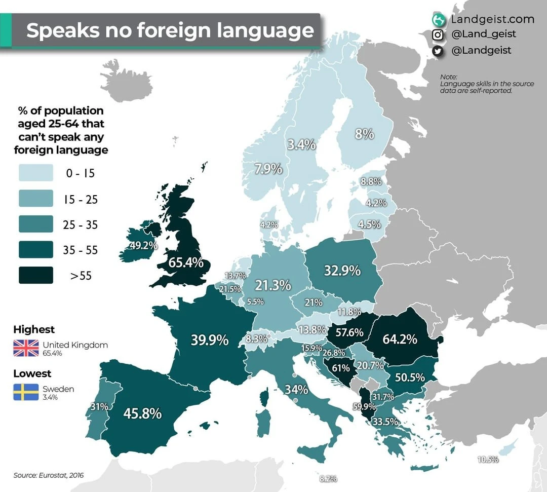
7. Population density in China 
8. What % of people would not want to live next door to LGBT people? 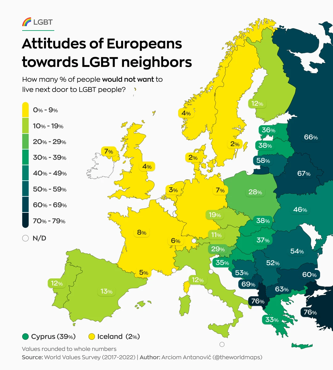
9. Chinese map, circa 1799 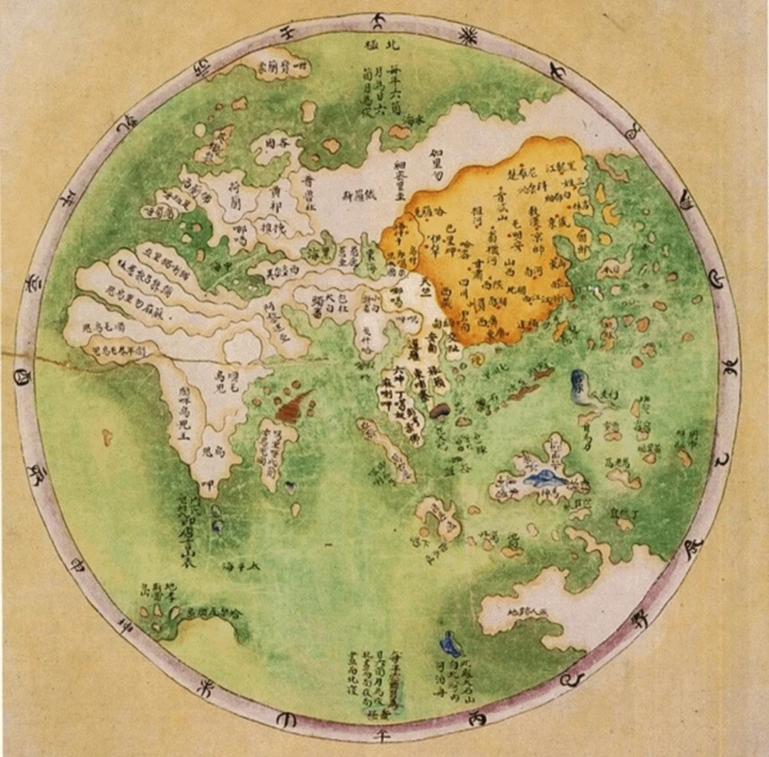
10. Percentage of male body hair 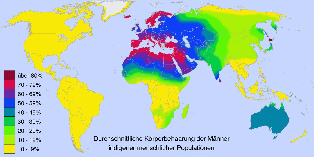
11. Animals are symbols of countries 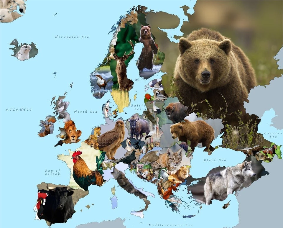
12. How much money do Americans spend on average on a wedding? 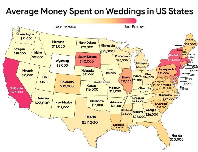
13. Unemployment rate in the provinces of Italy 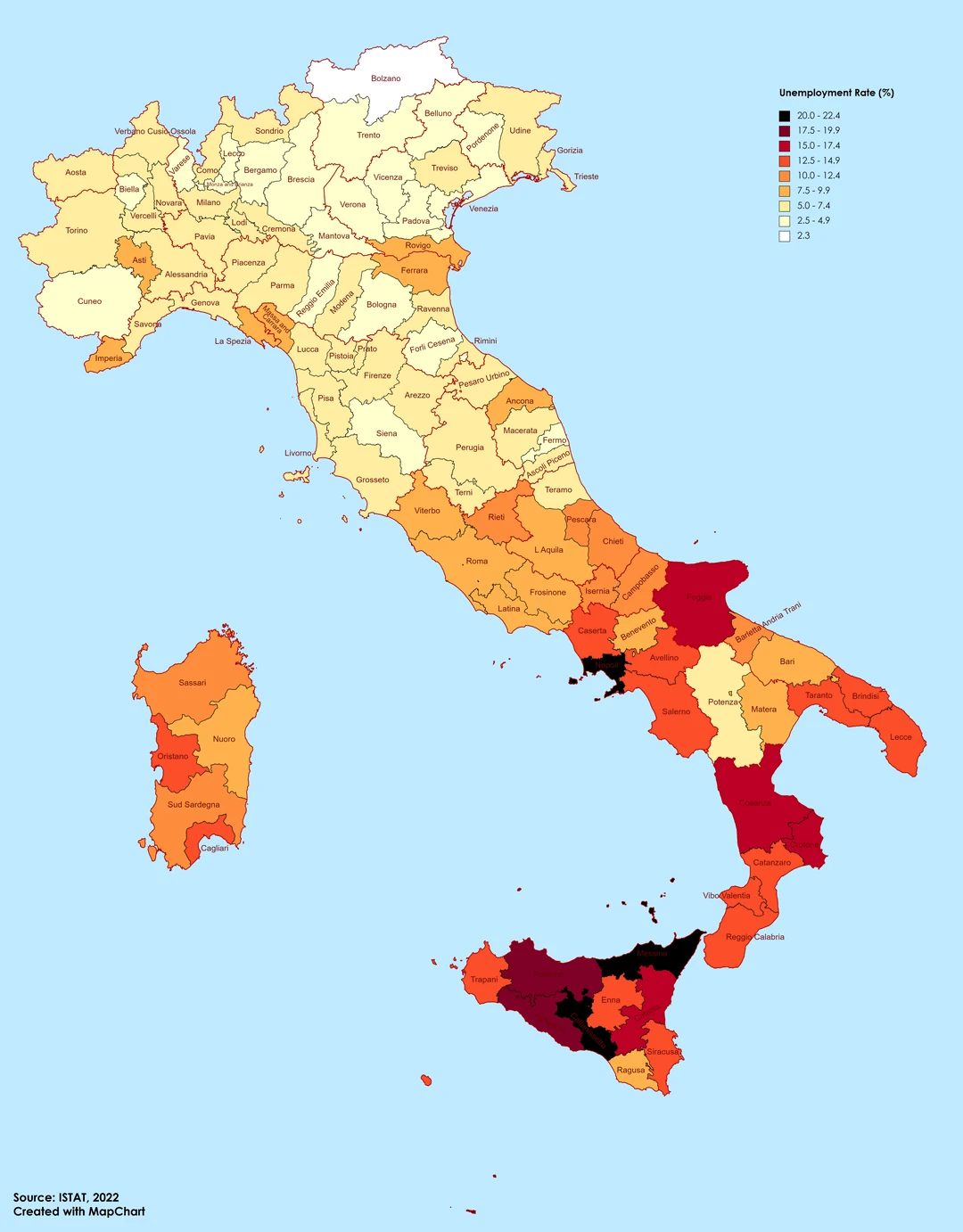
14. Found treasures with coins of the Roman Empire 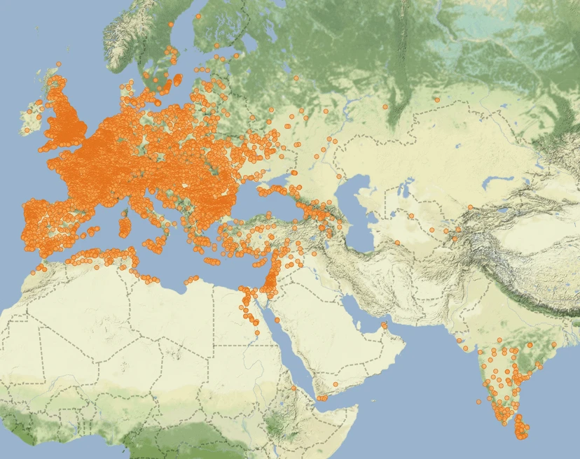
15. When are the days off? 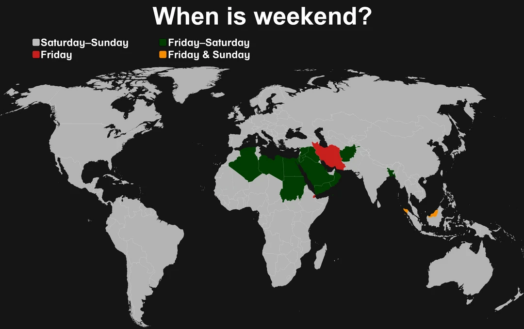
16. Main pollutants for household waste 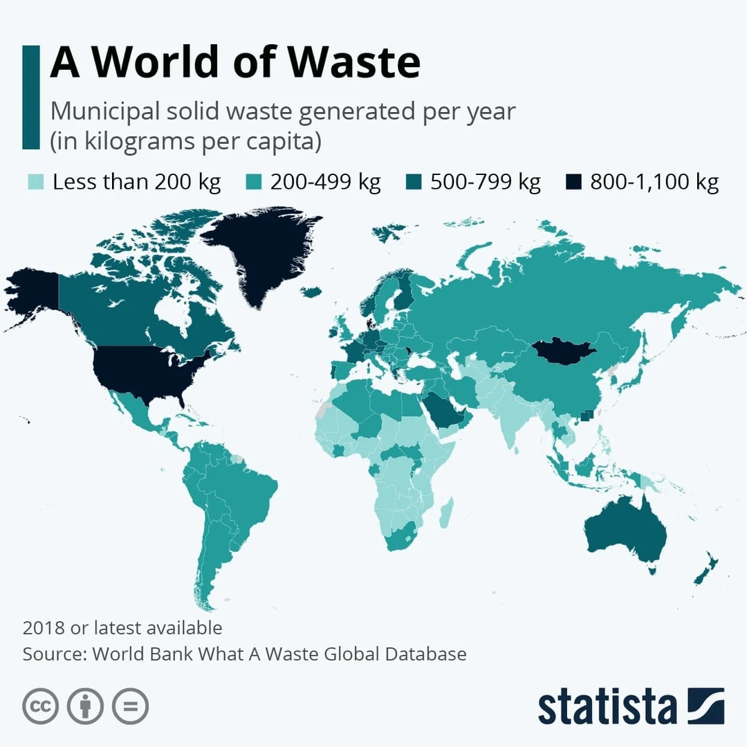
17. Belief in life after death 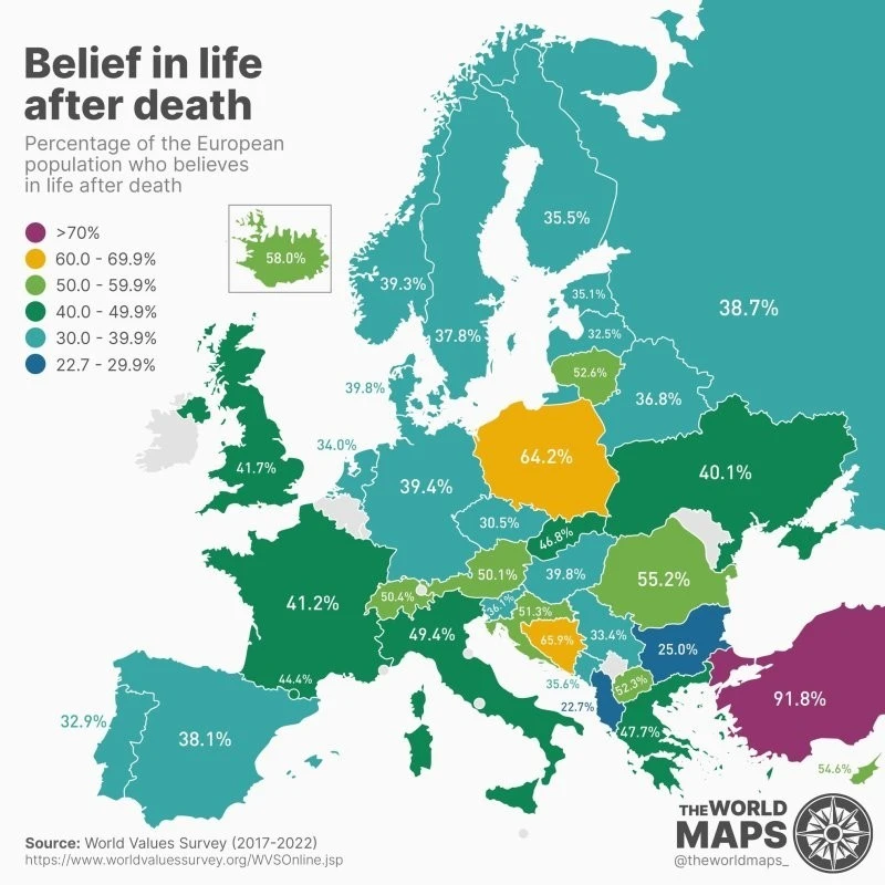
18. Most consumed types of meat, including fish and seafood 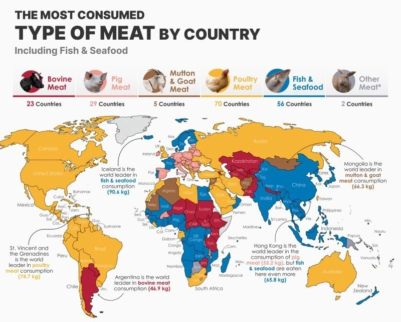
19. Sex ratio 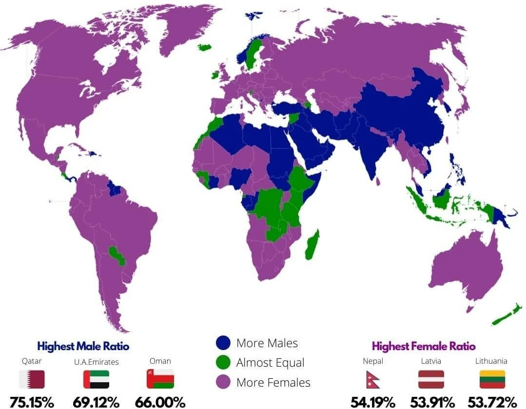
20. Countries with the most islands 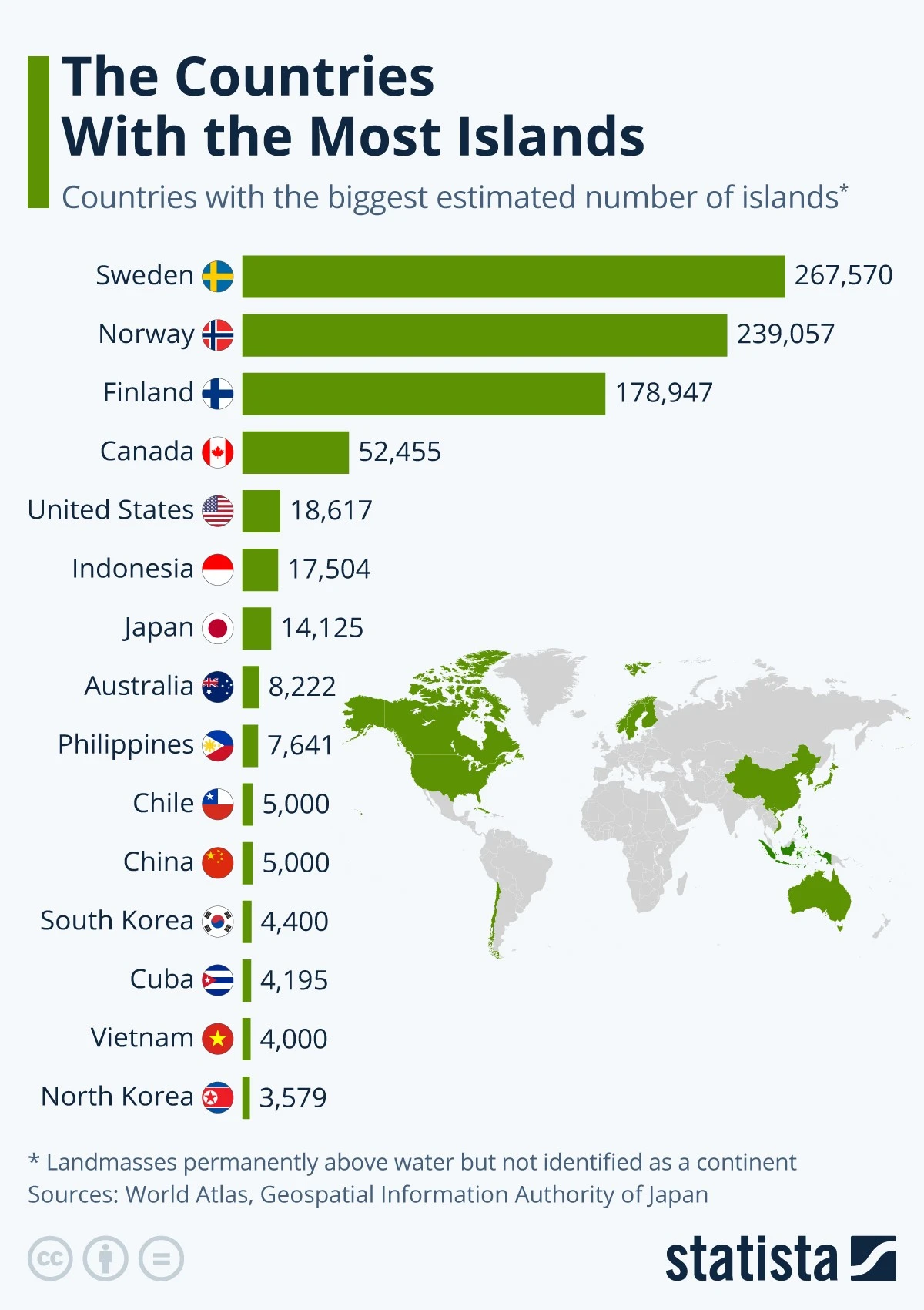
21. Percentage of blond and brown hair in European countries 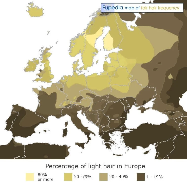
22. US states by crime rate 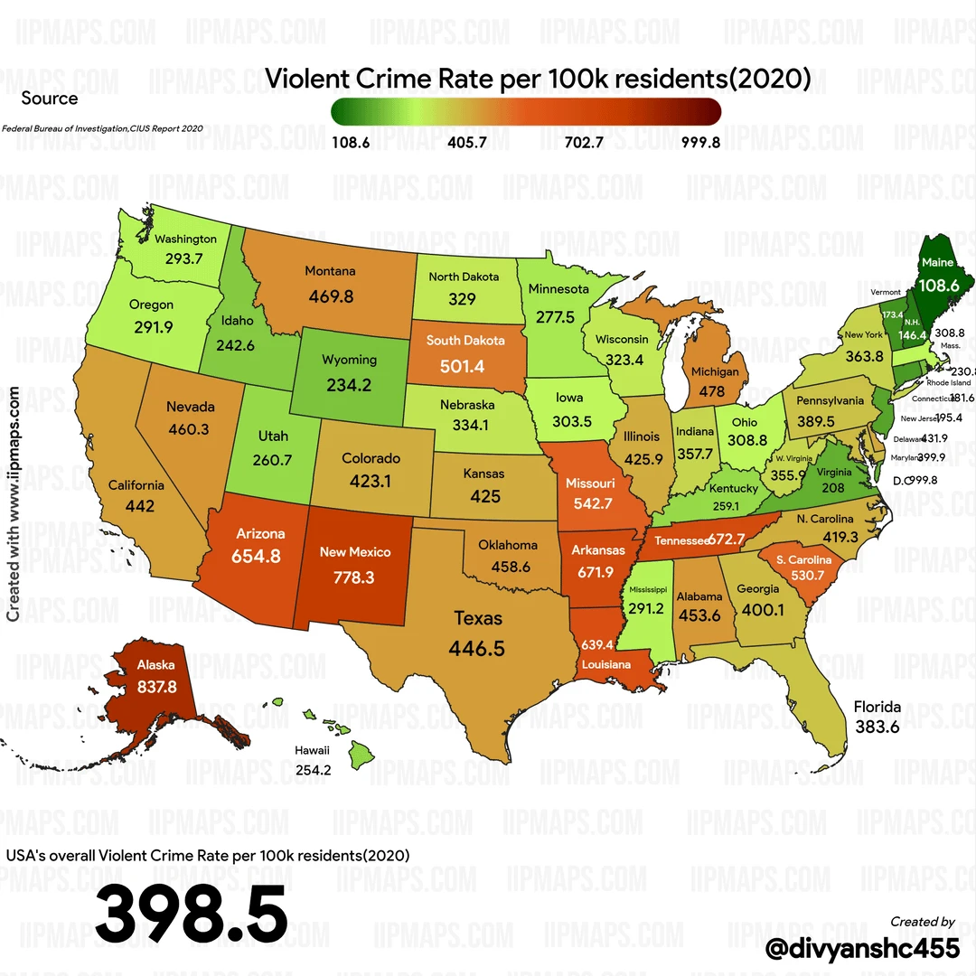
23. Air pollution in Europe 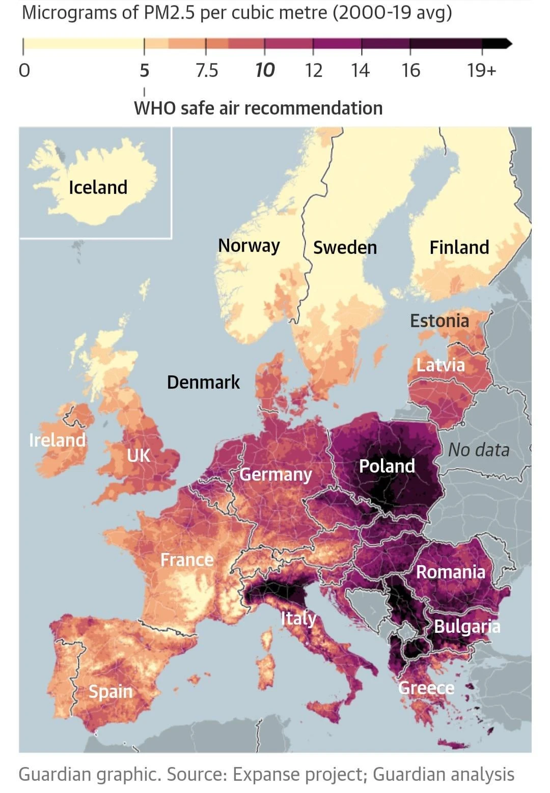
24. Accounting system in Asia. How to say the number 57? 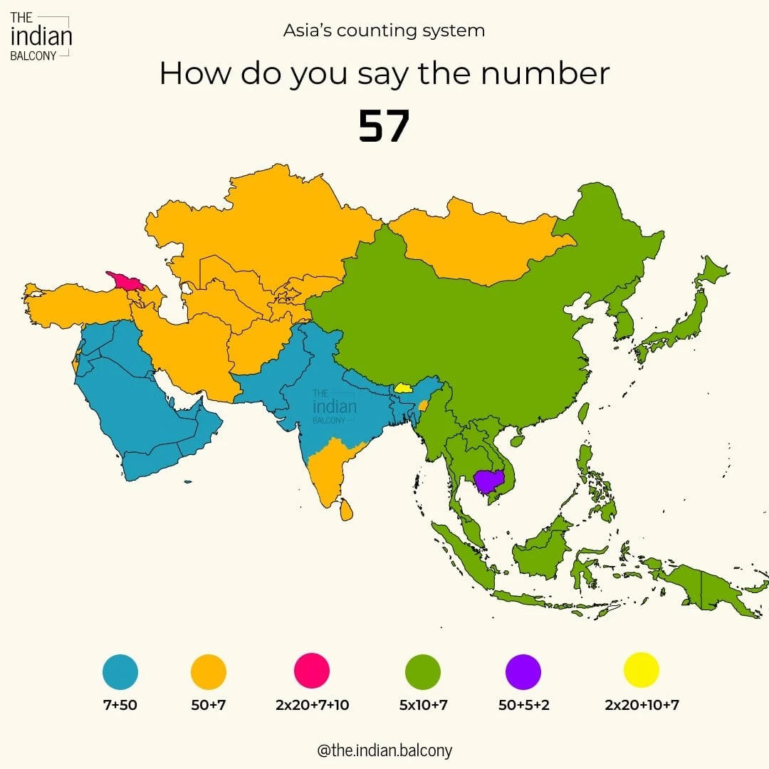
25. The happiest countries in the world 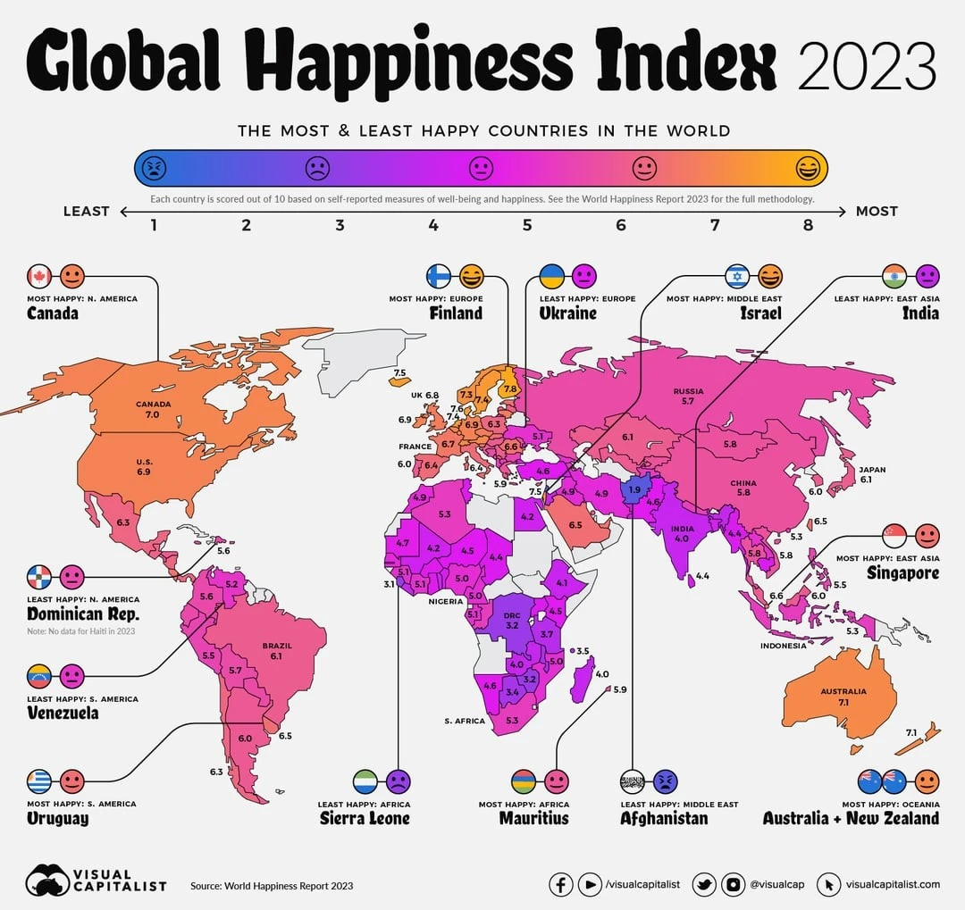
26. Highest temperature recorded in European countries 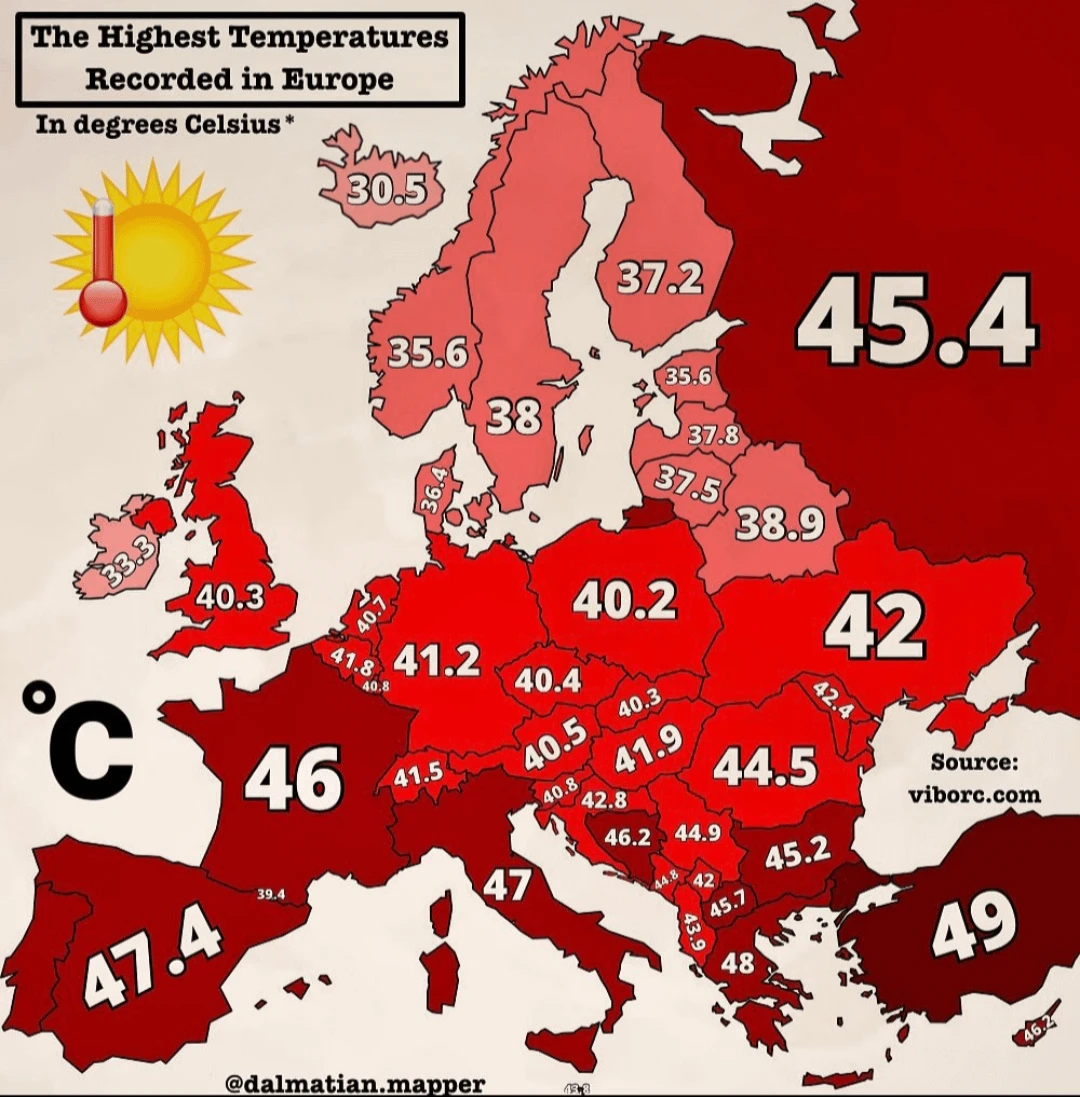
27. Projected level of water stress in 2040 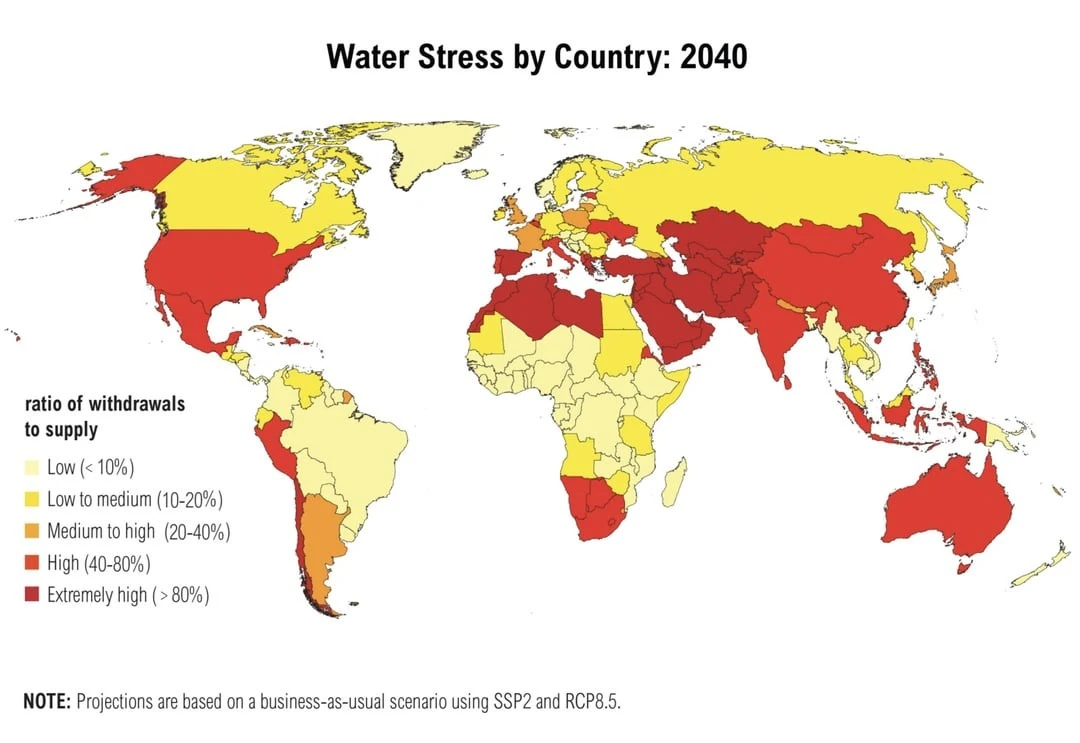
28. Statistics on refusals of tourist visas to the USA for 2022 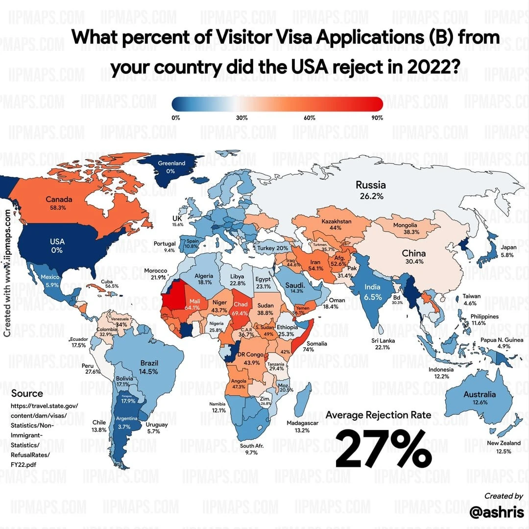
29. The highest mountains 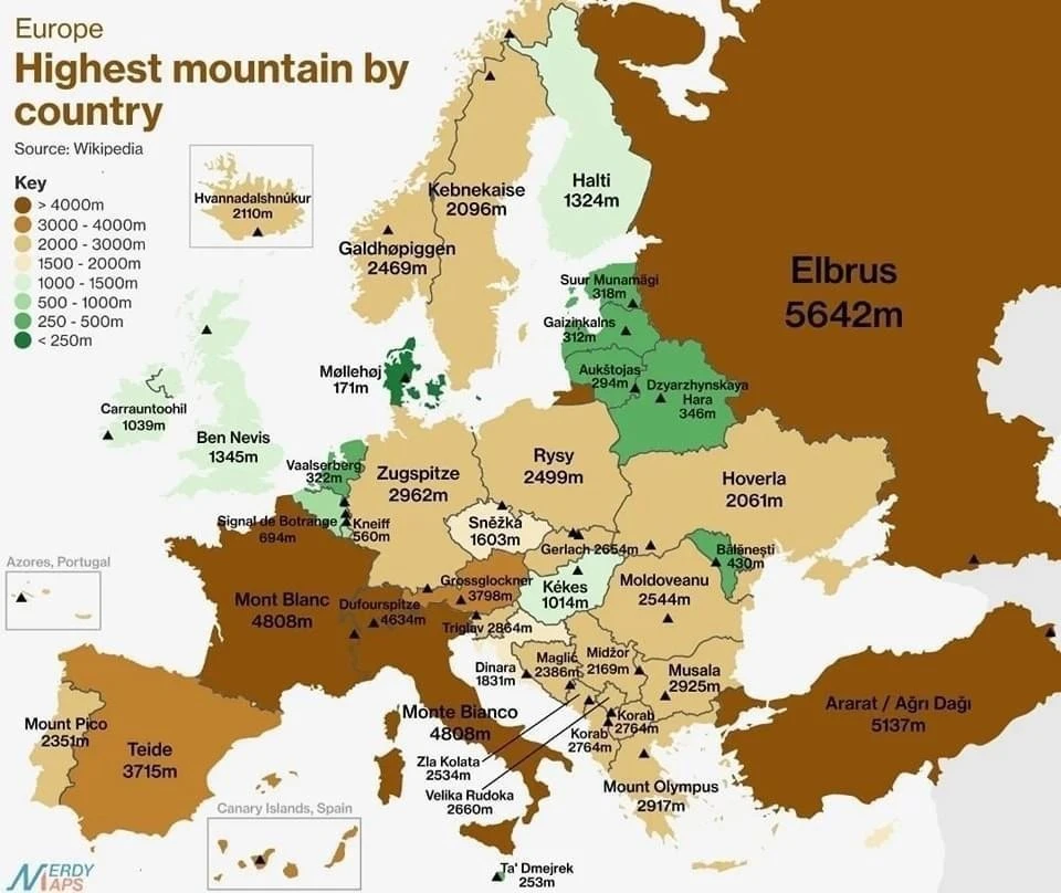
30. Food price inflation for July 2023 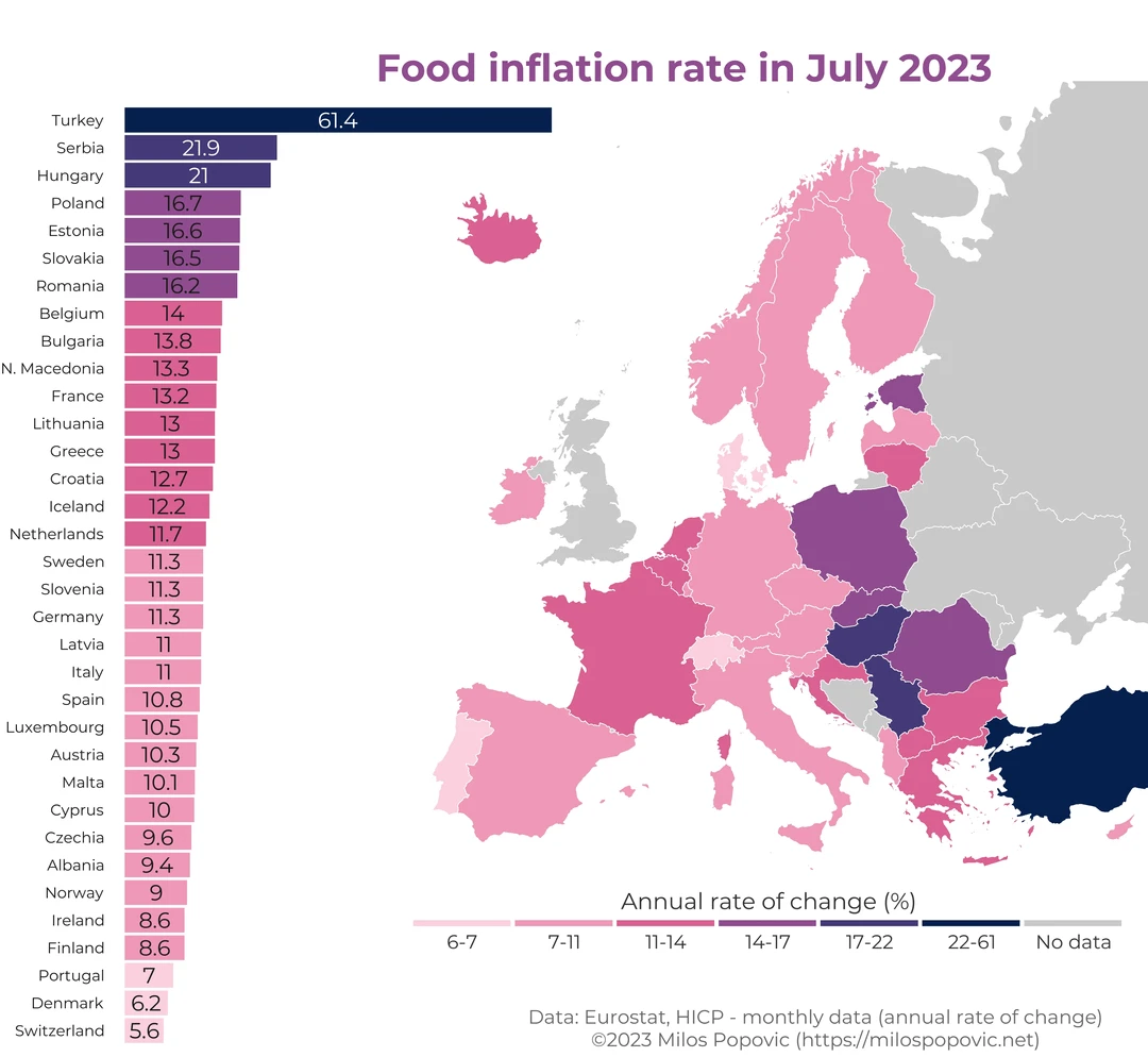
31. Favorite holiday destination for Europeans 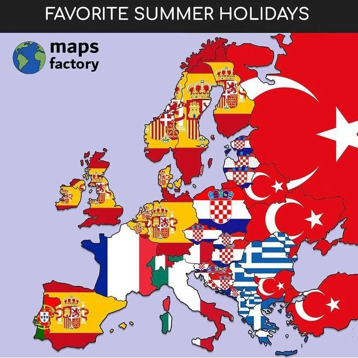
32. Most common blood type 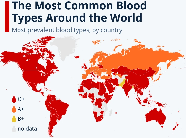
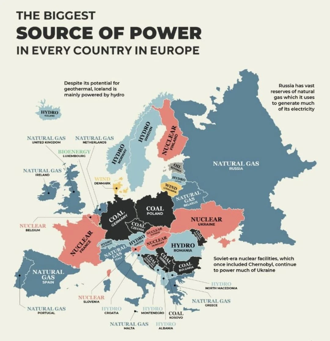
33. Main sources of energy in each European country