12 logos of popular social networks and instant messengers that have changed beyond recognition over time (14 photos)
I invite you to take a look at how much the logos of social networks and instant messengers, which have been well known to us for many, many years, have changed. 
Changing a logo design is a complex process that requires careful thought and planning. It can help a company strengthen its brand, highlight its innovation and attract attention. However, it should be remembered that changing the logo is always a risk, which may be accompanied by strong criticism from users and clients. Of course, over time, passions will subside and everyone will get used to the new design. However, in the future, users will still be nostalgic, complaining that it was better before. This is the pattern, and there is nothing you can do about it.
Instagram (2010/ 2016 to date) 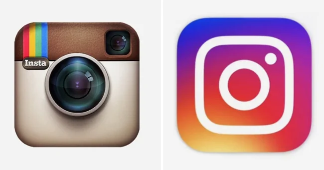
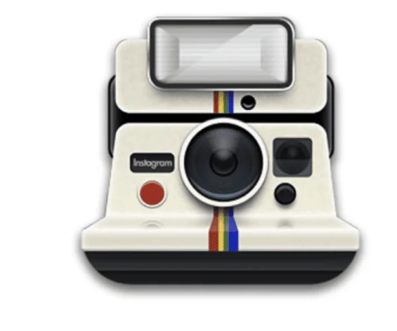
The picture on the left shows the very first official logo. Just below you can see a reference that the company did not approve for use because it was too inconvenient.
ICQ (1998-2014/ 2020 to date) 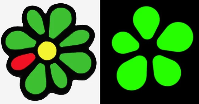
Many companies decide to change their logos to make them simpler and more modern. However, such innovations are not always successful. For example, many ICQ users were extremely unhappy with the design updates. They believe that the new logo now looks too dark and unrecognizable.
VKontakte (2006-2012/ 2020 to date) 
Skype (2003-2004/ 2019 to date) 
Twitter (2005-2006/ 2012 to present) 
Facebook (2005-2013/ 2019 to date) 
Odnoklassniki (2005-2011/ 2011 to date) 
Telegram (2013-2014/ 2019 to date) 
Snapchat (2011-2013/ 2019 to date) 
QQ (1999/ 2017 to date) 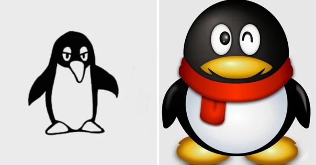
QQ is a popular instant messaging service that is widely used in China.
Discord (2015/ 2022 to present) 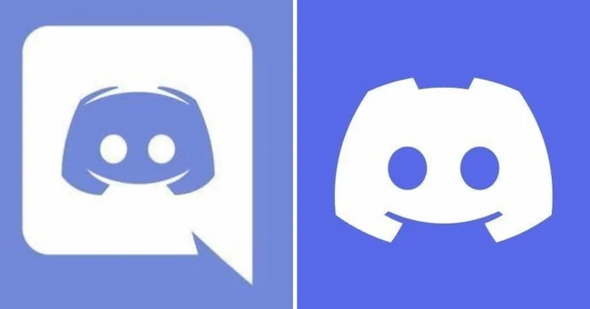
Pinterest (2010-2011/ 2016 to date) 